FindaFranchise Case Study
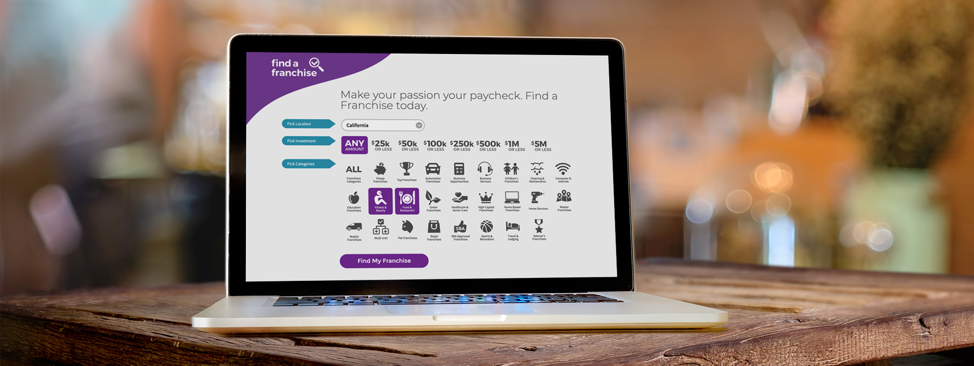
In 2018, I worked on the team responsible for the complete redesign of FindaFranchise.com. It involved rebranding, an entirely new codebase and an overhaul of the UX.
All this was completed in just over 6 months.
My Role
As the primary designer on this project, I lead the UX and UI efforts producing all related design assets and iconography. At various stages, I presented wireframes and prototypes to product managers, stakeholders, and engineers to refine collaboration and review of iterations. The logo redesign and color palette where handled by the Lead UX Designer. I teamed up with our front-end developer to define interactions and explore microinteractions.
The challenge
Complete overhaul in 6 months
The initial goal for this project was to get the site out of the Google penalty box and overhaul the UI with emphasis on site differentiation from the companies other related properties.
After reviewing the business goals and user needs we decided to include a heuristic review with several changes to the UX, primarily to move from a cart-style experience to a post conversion 1-click experience. Analytics revealed greater success in overall lead conversions with this approach.
An image is worth a thousand words
My Hypothesis
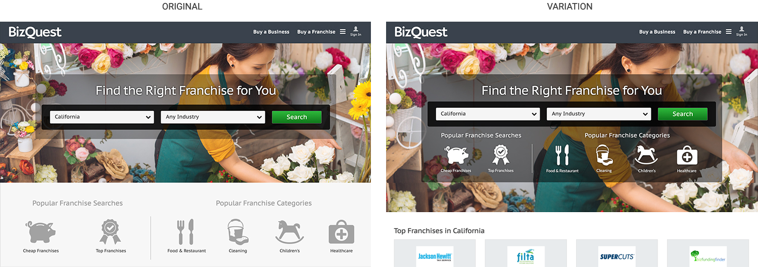
During the discovery phase, indicators in the analytics of our sister site, BizQuest, suggested a search started from the icons were more successful in lead submissions than searches started using the dropdown menu.
An A/B test was conducted to explore an icon-based search versus a dropdown-based search. The test revealed a 6.3% increase in lead conversions using the icon-search method.
I used this data to design a search experience around category icons. To expand the users result set, we also moved from a single category selection to allowing the user to search multiple categories at a time.
Technical Exploration
Wirefames
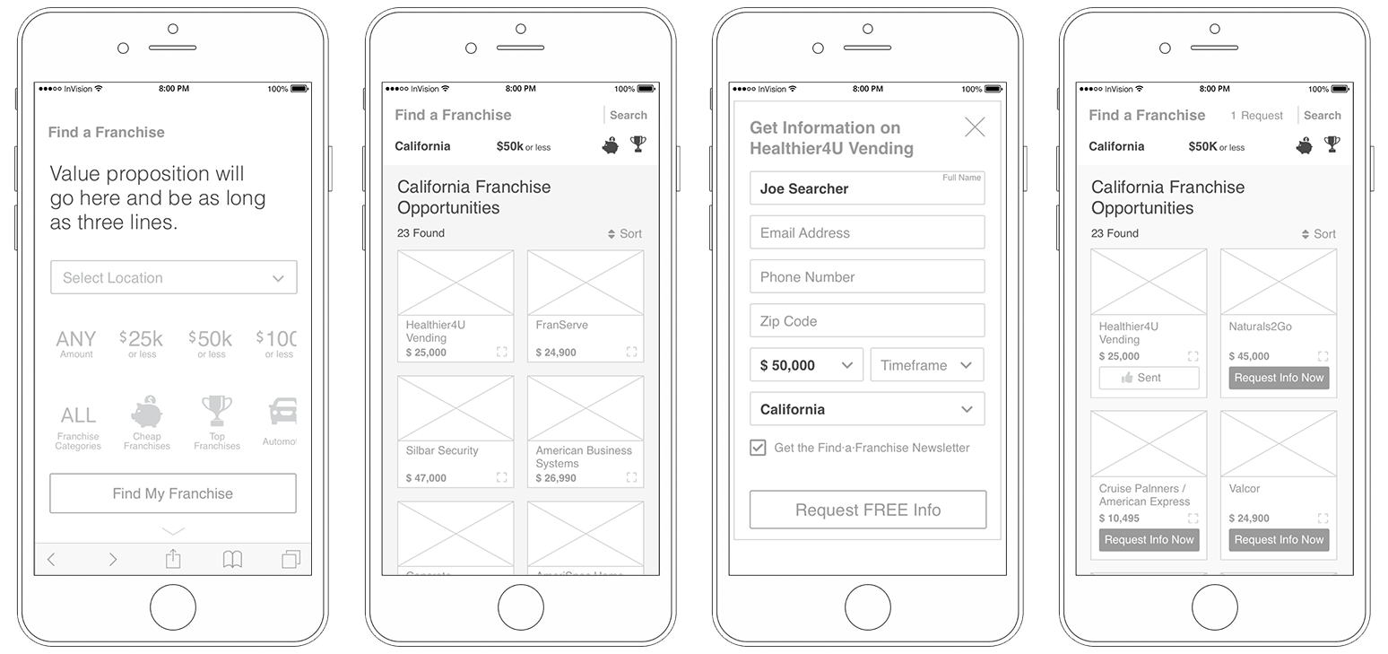
The engineering team took the opportunity to update the original codebase, developed in ASP.net and C#, in favor of Angular. This meant a learning curve for them and designing around technical limitations for me. To mitigate potential UX pitfalls, wireframes (desktop, tablet, and mobile) were reviewed at an early stage with the engineers.
Wireframes were also presented to stakeholders and product managers during various stages in the iteration cycle. Marketing, Customer Support, and SEO were all included in the design review process to provide comprehensive content delivery.
The personalization
Prototypes
Early user research revealed personalization increased engagement and lead submissions so we looked for opportunities to replace common, generic messages with a more conversational tone. Given our MVP approach to the project, we chose the home screen to rotate conversational messages based on the day of the week. I worked closely with Marketing to develop titles for the weekend, Mondays and mid-week.

Another way to convey personalization to the user is through microinteractions. I worked closely with the front-end developer to create and execute microinteractions for common tasks. We started simple with the intention to refine based on user feedback and continued usability testing.
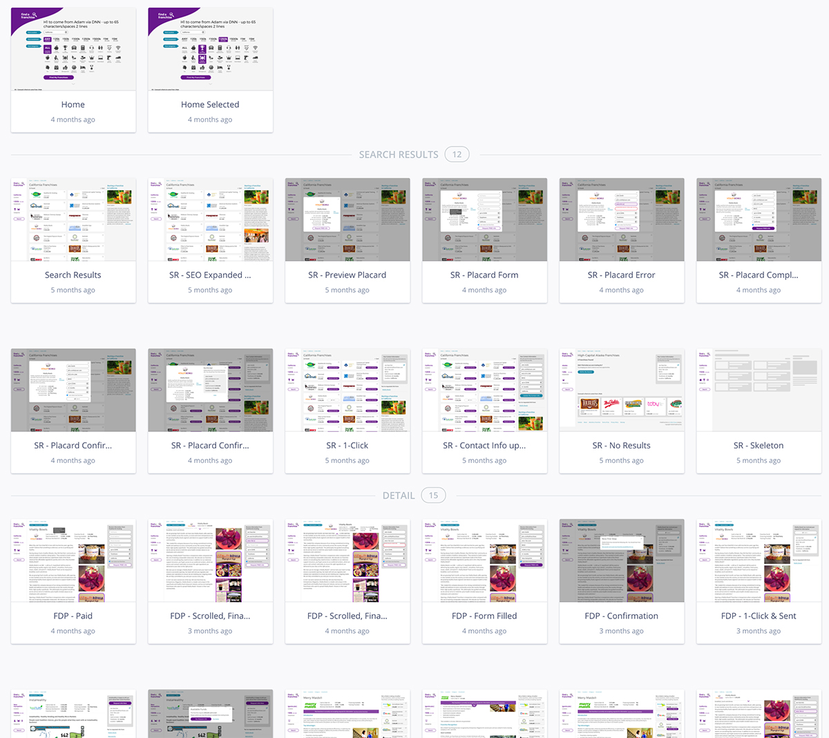
I created high-fidelity, interactive prototypes using Sketch and InVision to discuss and iterate user flows throughout the process. Prototypes were annotated with all relevant interaction notes.
Design System & Style Guide
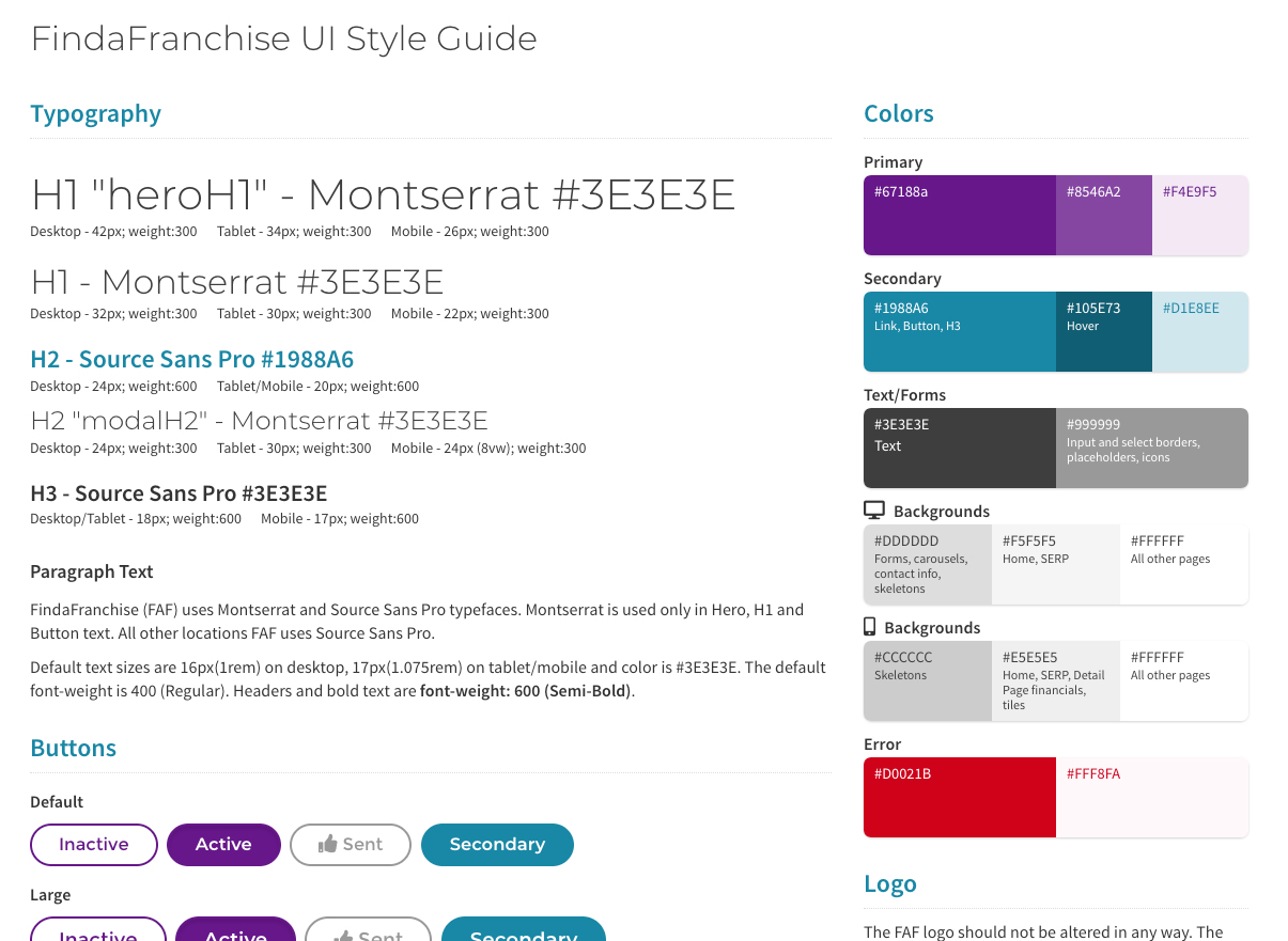
A Sketch design system was developed with a full library of common elements UI, icons, color palette, and typography.
To ensure consistency in the development stage, a HTML/CSS style guide was created for reference by the engineers building the site and QA team confirming execution of the design deliverables.
An experiment
Button States
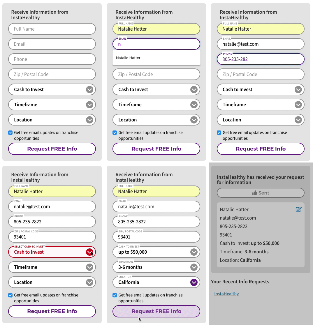
One big barrier in conversions is often the way error messaging is handled. Unnecessary, or optional, data collection will slow down the user from completing a task. Errors add frustration and cognitive load. So I had to ask myself, what can be done to limit this friction?
Perhaps creating a mental model around task completion.
In an effort to reduce errors in forms, I created buttons states as progress indicators to inform the user when all required data had been input correctly allowing them to complete their task. By utilizing these buttons states for all task-oriented user actions we could build up their mental model signaling successful completion of the task and prevent error messages from appearing.

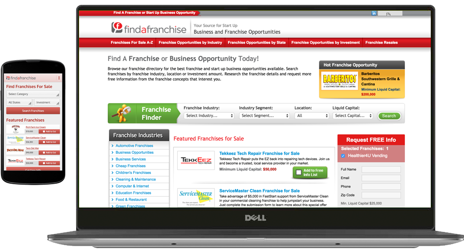
Before
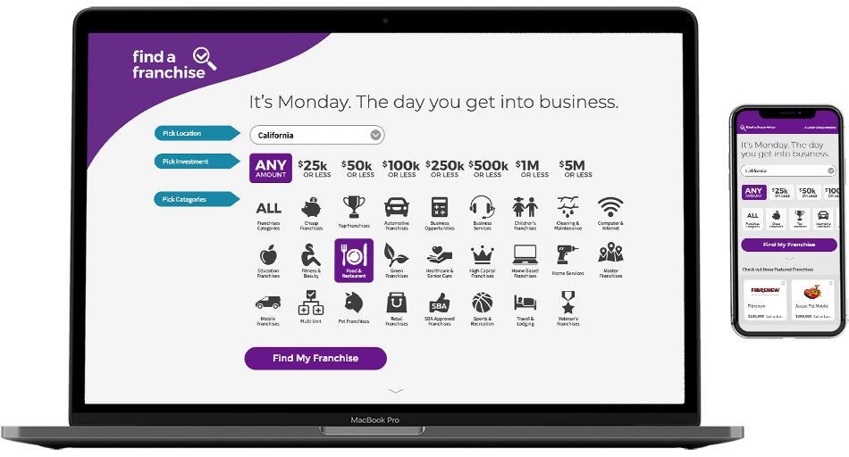
After
Impact
The FindaFranchise redesign was driven by the need to improve performance by repairing the structural problems which caused it to all but be eliminated from Google search results. We planned to evaluate analytics and run A/B tests immediately so we might iterate for easy wins.
This project was deployed shortly before the office I worked out of was closed. Given more time with this site, here's what I would do to ensure a more robust user experience:
- Conduct a usability study to uncover pitfalls and reveal opportunities.
- Run an A/B test to validate button state experiment.
- Explore and test an autosuggest search experience. Observing users in previous tests suggests searchers tend toward brand recognition when seeking franchise opportunities.
- If moving to a autosuggest search experience, utilizing Artificial Intelligence integration would rapidly improve the keyword library.